Inverse Transform Sampling with Python
Before we start with inverse transform sampling, let’s look at an example to build some motivation. Let’s say you are building an air-flight time simulator. That is, for a specific route (say Berlin to Paris), you want to know what would be the time taken by a flight?
To answer this question, you start collecting data for that route and note down the time taken for each flight. Here is a snippet of what your observations might end up looking like:
[[28, 29, 30, 31, 32, 33], [2000, 4040, 6500, 6000, 4020, 2070]]Here, the first list shows the time for the route between Berlin and Paris, and the second list shows the frequency of those observations. For example, the data shows 2000 flights were able to complete the trip in 28 minutes, 4040 in 29 minutes and so on. Notice that the flight time is following a certain distribution (almost bell curve like).
Going back to our original discussion, inverse transform sampling allows to generate samples at random for any probability distribution, given its CDF (cumulative distribution function). So, in the case of flight time simulation, inverse transform sampling can be used to predict the times of next N flights, given our obserations. There’s a great explanation on Wikipedia of this method, but here’s a gist of it.
1- Normalize a distribution in terms of its CDF (cumulative distribution function).
2- Generate a random number u from standard uniform distribution in interval [0, 1].
3- Compute an event x from the distrubtion such that f(x) = u.
4- Take x to be the random event drawn from the distribtion.
Right, enough talking, let’s dive into the code. Start with importing some libraries.
import numpy as np
from matplotlib import pyplot as plt
import numpy.random as ra
For actual analysis, let’s take a more real problem, the one which I worked on as a part of stingray project. In X-ray astronomy, we have detectors that provide us information about energy-flux distribution. Given that information, we need to simulate energies for independent events. The problem is quite similar to the above flight example, just with a different wording.
Step 1: Generate Cumulative Distribution Function
Below is a sample energy-flux spectrum which follows an almost bell-curve type distribution (anyway, the specific type of distribution is not important here). It is a 2-d array which contains an array of energies and an array of fluxes.
spectrum = [[1, 2, 3, 4, 5, 6],[2000, 4040, 6500, 6000, 4020, 2070]]
energies = np.array(spectrum[0])
fluxes = np.array(spectrum[1])
To compute cumulative probability, first we compute probabilities of flux and then use numpy’s cumsum() function.
prob = fluxes/float(sum(fluxes))
cum_prob = np.cumsum(prob)
Right, we have normalized fluxes in an interval between [0, 1].
Step 2: Generate Random Numbers
We draw ten thousand numbers from uniform random distribution. Here, 10000 happens to be the number of events we want to assign energies to.
N = 10000
R = ra.uniform(0, 1, N)
Step 3: Generate Samples
Recall the step 3 we discussed at the start. We are going to implement it here.
gen_energies = [int(energies[np.argwhere(cum_prob == min(cum_prob[(cum_prob - r) > 0]))]) for r in R]The command might look a bit messy but let’s understand it bit by bit. First, we look to find the bin interval in which the random number (from the uniform distribution) lies. To find that out, we look for the nearest bin using min(cum_prob[(cum_prob - r) > 0])) . We then find the argument where we found the minimum value using np.argwhere() and finally, we feed that to ‘energies’ because after all, we are looking to simulate event energies. Done!
Step 4: Testing
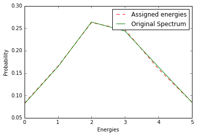
How do we know whether our simulation is actually following spectrum? A good way is to create a histogram of simulated events and compare it with actual events. So, let’s do that.
gen_energies = ((np.array(gen_energies) - 1) / 1).astype(int)
times = np.arange(1, 6, 1)
lc = np.bincount(gen_energies, minlength=len(times))
Notice, the distribution is very similar to the one we initially defined! Finally, let’s compare and visualize the results.
plot1, = plt.plot(lc/float(sum(lc)), 'r--', label='Assigned energies')
plot2, = plt.plot(prob,'g',label='Original Spectrum')
plt.xlabel('Energies')
plt.ylabel('Probability')
plt.legend(handles=[plot1,plot2])
plt.show()